


Brand Guidelines
This guide outlines the visual language and design principles that make Cronus recognizable, regardless of the team or medium.
Cronus combines focus with minimalist calm to reclaim attention using large-language-model intelligence, enhancing human output by at least one percent.
Every standard—color, type, spacing, message, and accessibility—expresses this promise with clarity.
Whether digital product, marketing site, or print, if it bears the Cronus mark, it should feel friction-free, quietly confident, and purpose-built to keep users in flow.
Follow these rules to reflect the trust and precision at the heart of Cronus.
Contents
01
Brand Strategy
02
Personality
03
Logo
04
Color
05
Typography
01
Brand Strategy
Every workday is full of pings, pop‑ups, and quick tab switches. These tiny breaks steal time and slow down great teams—even when the talent is there.
Cronus gives that time back.

Cronus spots a distraction the moment it happens and helps you return to the task at hand.
Our goal is clear: raise each person’s output by at least 1 percent. No strict rules, no guilt‑driven timers—just smart nudges powered by large‑language‑model tech and a simple interface that stays out of the way.
We don’t just block noise; we turn lost minutes into real progress. When focus holds steady, tomorrow’s results come faster.
02
Personality
Cronus speaks the same way it works: calm, clear, and laser‑focused on what matters right now.
We cut through noise, surface only the facts you need, and nudge you forward—never nag, never hype.
1a
Tone & Voice
Our Vision: why we exist
A world where every knowledge worker ends the day with attention—and energy—to spare.
Our Mission: what we do
Give people back at least 1 percent of their work time by detecting distractions the moment they appear and guiding focus with LLM intelligence.
Our Promise: how we help
Cronus quietly guards your attention and turns lost minutes into progress—no rigid rules, just timely, goal‑aware nudges that keep you in flow.
North Star Narrative: the one‑paragraph story all copy should orbit
Cronus is the quiet co‑pilot that notices the moment your attention drifts—and nudges it back before productivity leaks out. Powered by large‑language‑model intelligence, the app watches context, not just time, turning every window switch and Slack ping into actionable insight. The result: at least a one‑percent lift in human output, delivered with zero rigid rules and a UI so clean it fades from view.
1b
Sample Copy
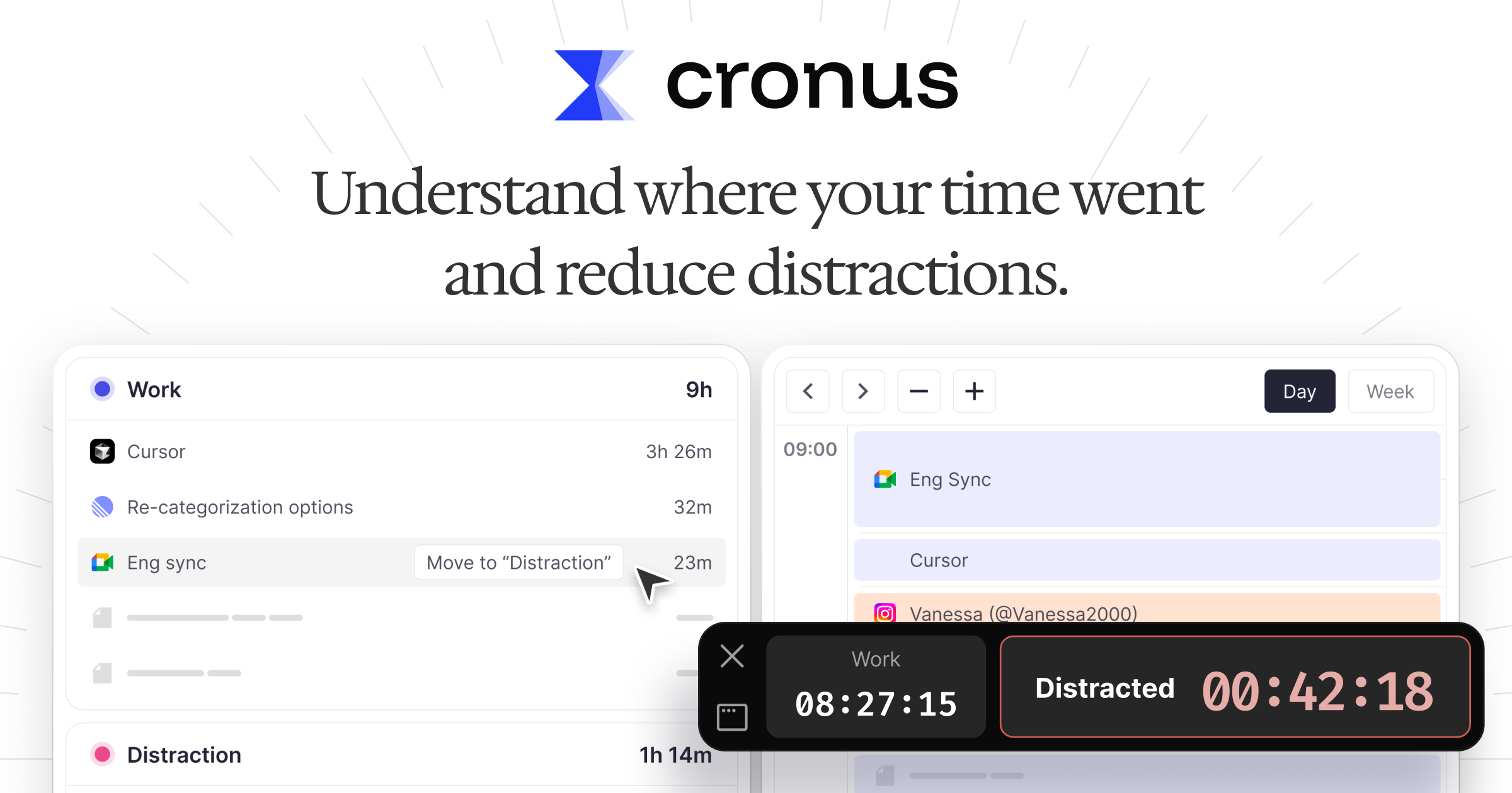
Your next task window opens in 3 minutes—shall we prep?
Minimal, never sparse. Say just enough to prompt action, then get out of the way.
You gained 27 minutes of focus compared to yesterday.
Data‑smart, never jargon‑heavy. Stats in plain numbers; no ML buzzwords.
Nice streak—four deep‑work blocks today.
Warm, not chatty. Encourage; don’t over‑celebrate.
Time to refocus—Instagram has been open for 5 minutes.
Direct, not bossy. Skip the fluffy lead‑ins.
When in doubt, shorten the sentence, make the verb tangible, and cut any cheerleading adjectives.
03
Logo
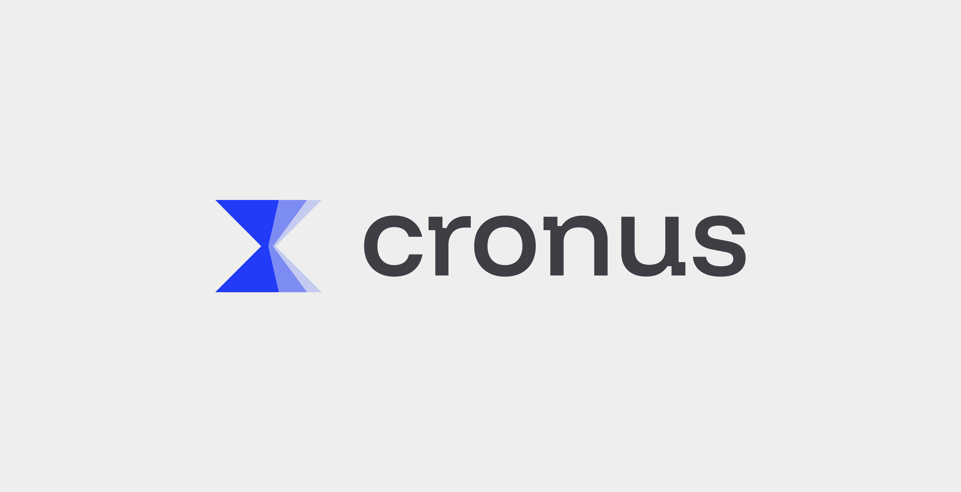
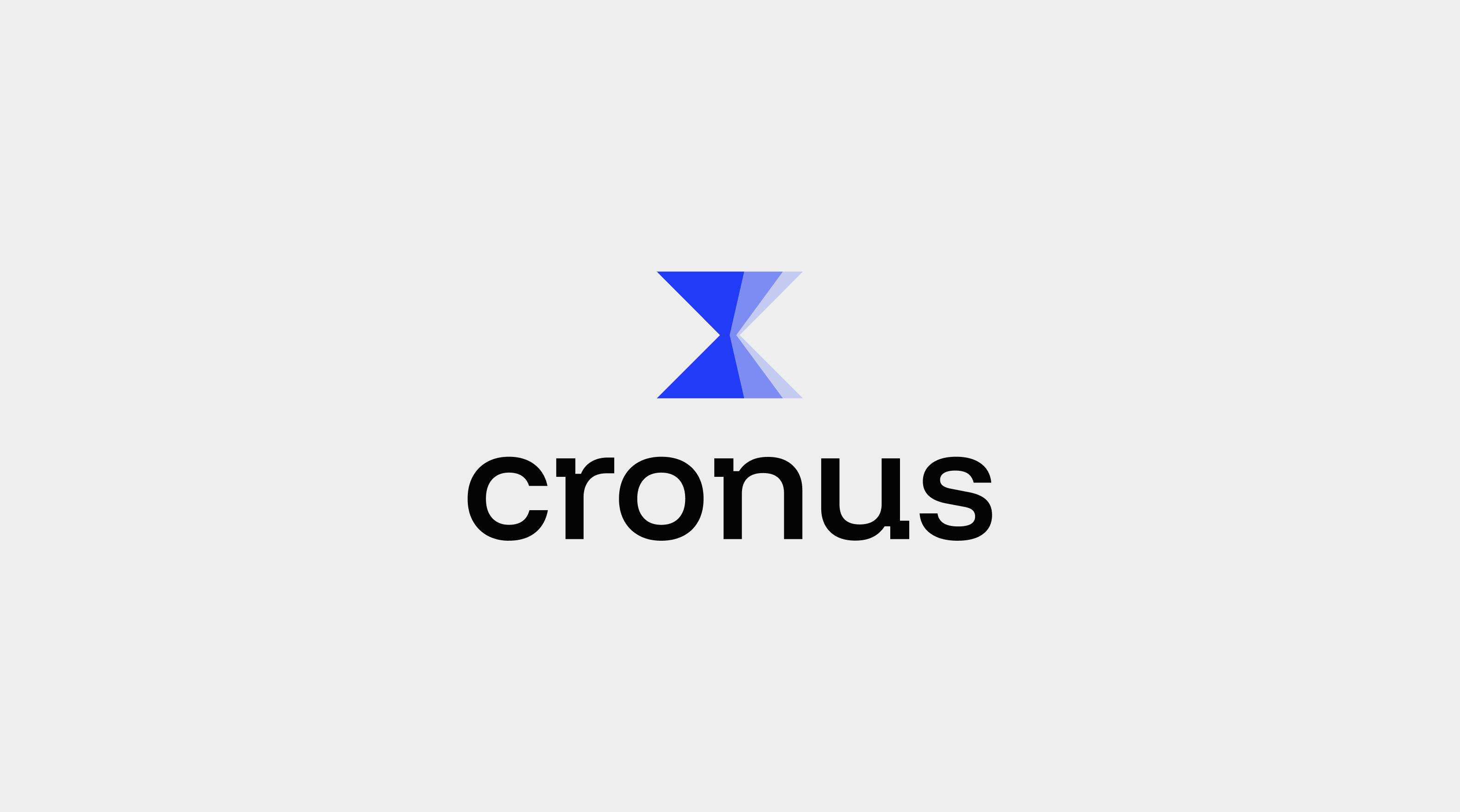
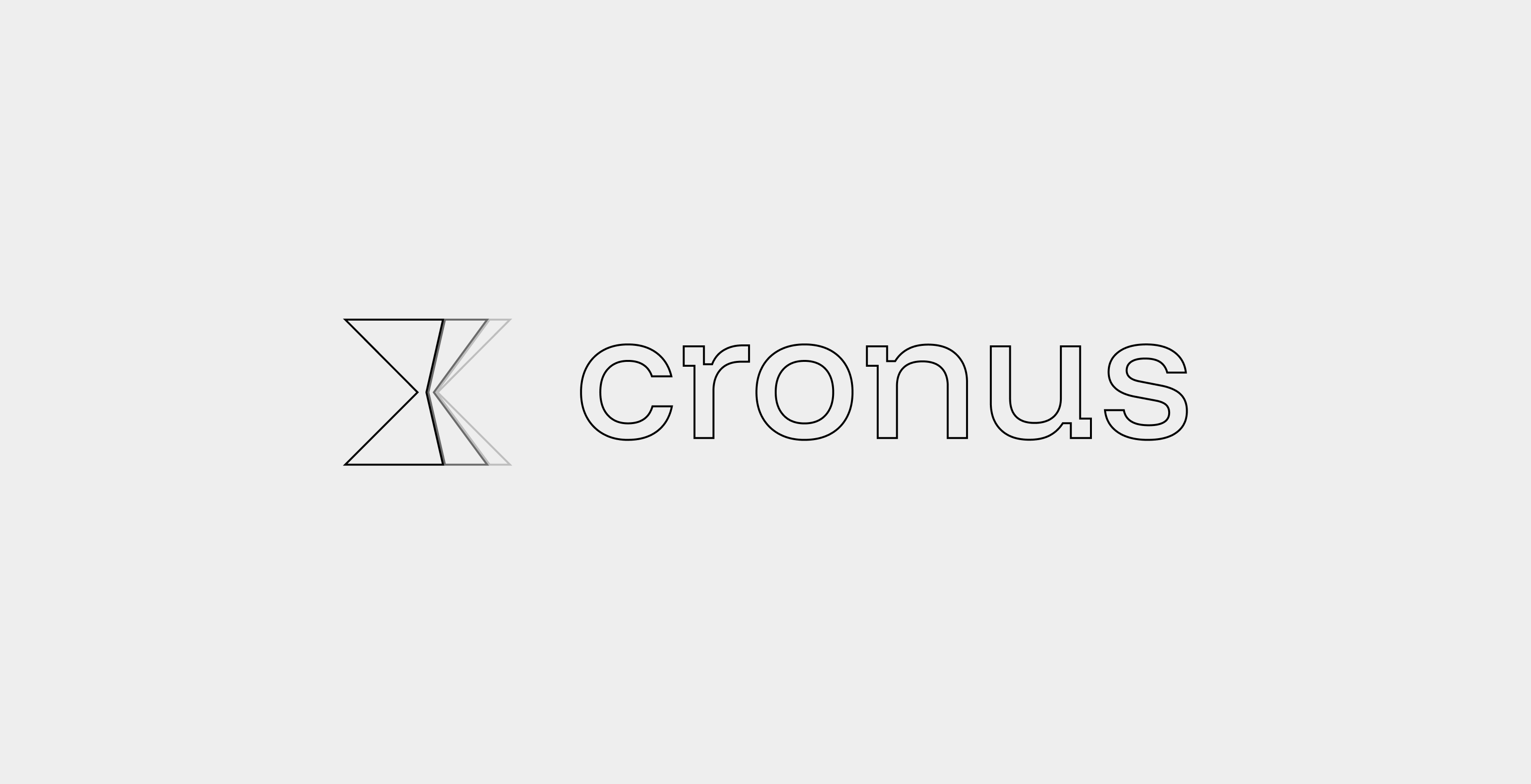
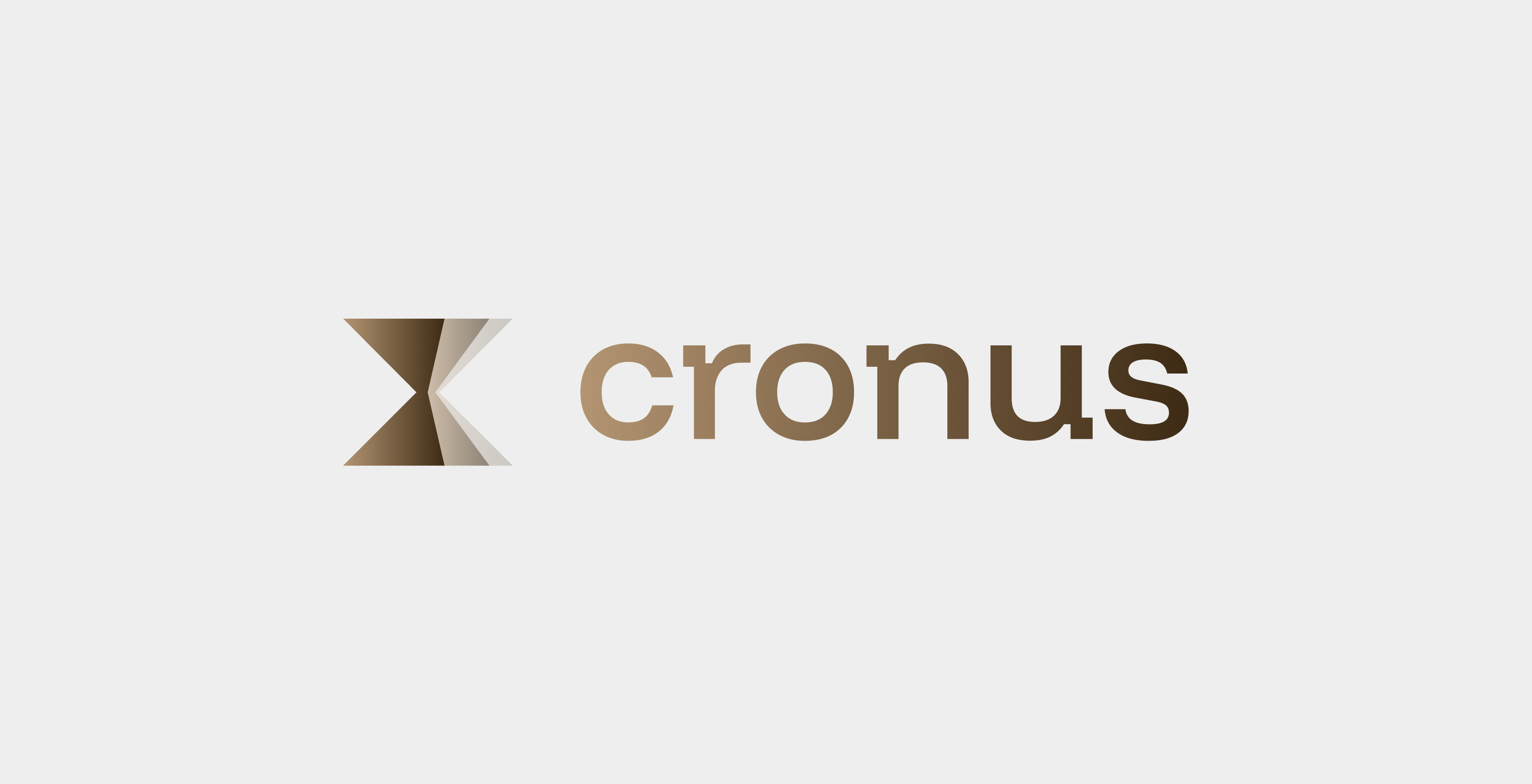
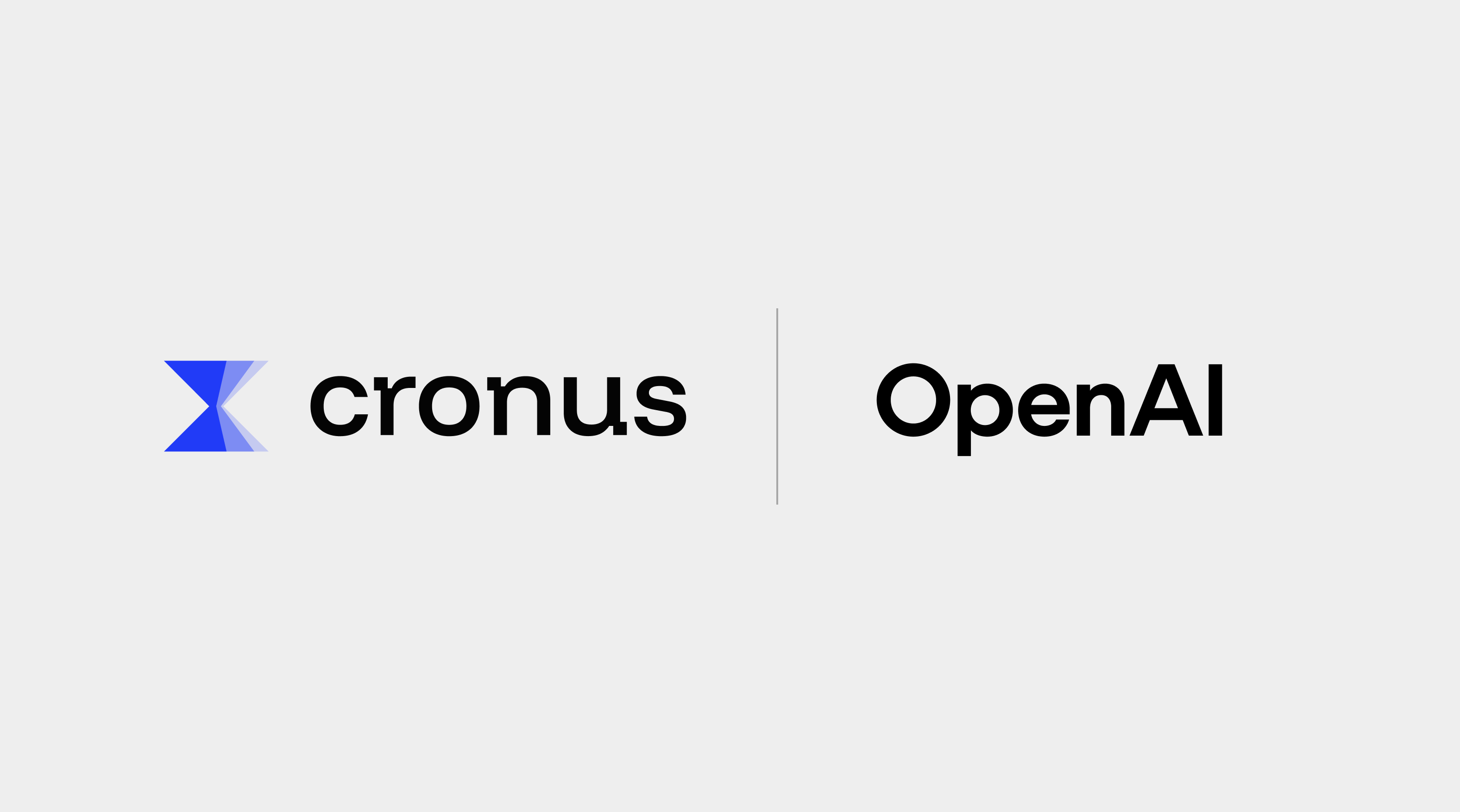
The Cronus logo is a precision‑cut hourglass: two mirrored triangles meeting at a single point, rendered in a clean three‑step gradient.
Form – The sharp hourglass captures the moment when sand narrows through the center—our metaphor for catching a distraction the instant it appears.
Three‑Level Shade – Each tonal band stands for past, present, future attention. Together they show how Cronus observes context over time, not just a single timestamp.
Geometry – Hard edges and symmetry mirror our minimalist product design and data‑driven accuracy. No curves, no clutter—just intent.
It’s more than a symbol, the hourglass commits Cronus to a simple promise: guard every second of attention and turn it into forward momentum.
3a
Primary Lockup
3b
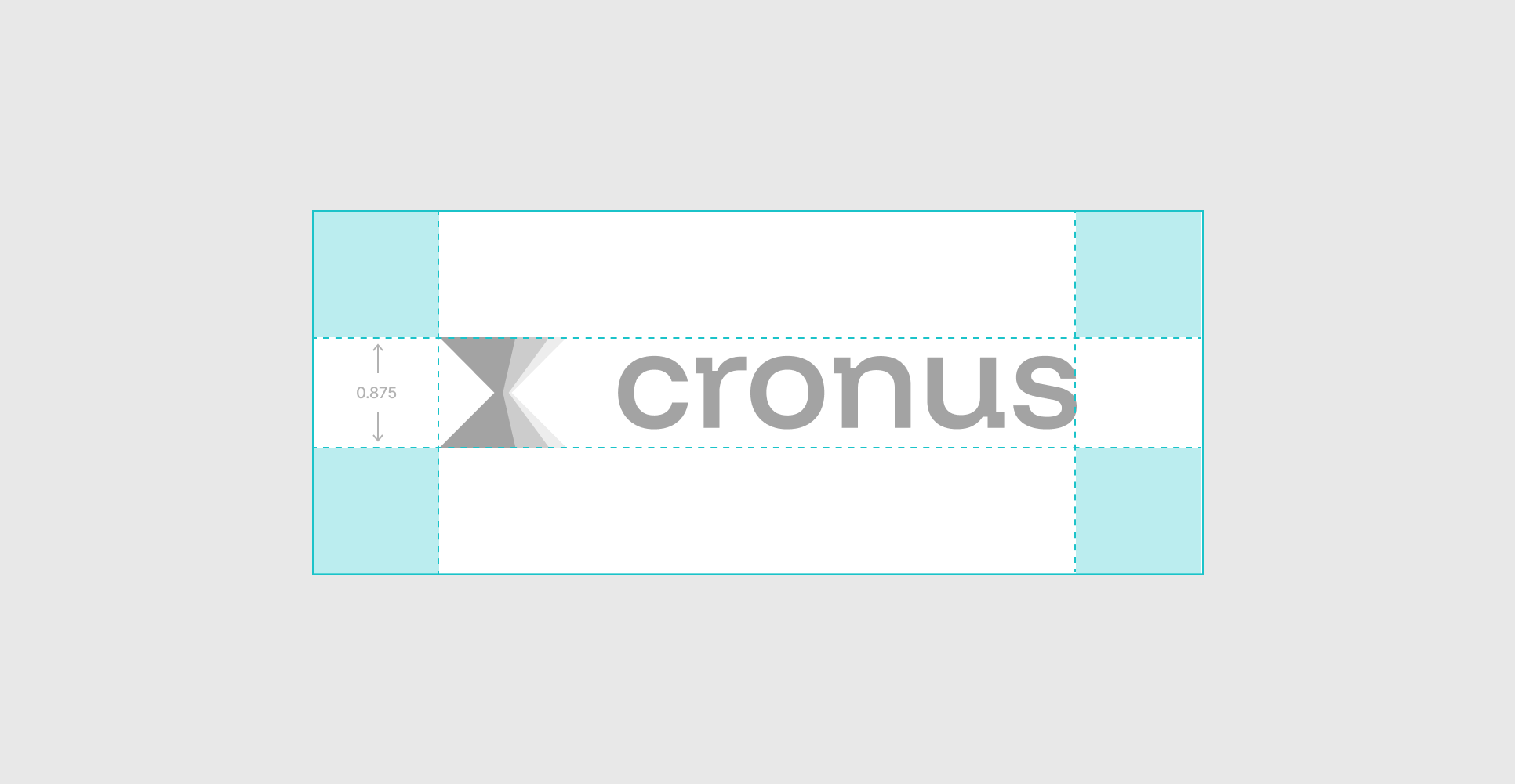
Clearspace
3c
Secondary Lockups
3d
Product Mockups
3e
Incorrect Usage


Do not resize the mark
Do not rotate the logo
Do not change the color of the mark alone
Do not outline the logo

Do not reverse the lockup
Do not add gradients the logo
3f
Partnerships
04
Color
Colors in Cronus do more than decorate; they signal where the user’s attention should go and why it matters. Each shade is chosen to reinforce our promise of quiet focus and forward motion.
Keep Electric Teal scarce; over‑using it dulls the urgency of a nudge.
Handled with discipline, this color palette makes Cronus instantly recognizable: grounded, calm, and relentlessly moving time in the right direction.
3a
Primary Palette
Deep Graphite
Hex: #242437
Slate
Hex: #3E3F45
White
Hex: #FFFFFF
Deep Blue
Hex: #213BF7
3b
Gradient Palette

Gradient 1

Gradient 2
Gradient 3
Gradient 4
05
Typography
Cronus’ typography balances clarity and professionalism with a modern yet timeless type pairing, reinforcing our commitment to clear focus.
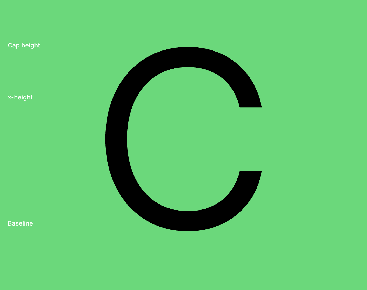
Primary Sans-Serif (Inter) is a clean, modern sans-serif typeface that ensures legibility and precision across all digital and print materials. Its geometric structure reflects clarity, efficiency, and trust, making it the ideal choice for data-heavy content, dashboards, and user interfaces.
Secondary Serif (Hedvig Letters Serif) is a refined, authoritative serif font that adds a touch of tradition and credibility. Used for emphasis in headlines, insights, and headings in reports, it reinforces Cronus’ expertise and reliability.
This sans-serif and serif combination creates a dynamic contrast—modern yet trustworthy, analytical yet approachable, ensuring Cronus’ brand communication is always clear, professional, and dependable.
- Primary Typeface
Inter
- Secondary Typeface
Hedvig Letters Serif
5b
Sizing
Lorem ipsum dolor sit amet, consectetur adipiscing elit, sed do eiusmod tempor incididunt ut labore et dolore magna aliqua. Ut enim ad minim veniam, quis nostrud exercitation ullamco laboris nisi ut aliquip ex ea commodo consequat.
Cronus is the quiet co‑pilot that notices the moment your attention drifts—and nudges it back before productivity leaks out. Powered by large‑language‑model intelligence, the app watches context, not just time, turning every window switch and Slack ping into actionable insight. The result: at least a one‑percent lift in human output, delivered with zero rigid rules and a UI so clean it fades from view.
Type Sizes 0–24pt/px
130% Leading
-2% Tracking
Handled with discipline, this color palette makes Cronus instantly recognizable: grounded, calm, and relentlessly moving time in the right direction.
Type Sizes 24–55pt/px
120% Leading
-3% Tracking
Whether it’s a social media website, a glance at the profile, or a work-only website, we ensure you don’t have to worry about distractions.
Type Sizes 55–72pt/px
110% Leading
-3% Tracking
Focus, unbroken.
Type Sizes > 72pt/px
100% Leading
-3% Tracking


Back to the top
↑
© Cronus
All Rights Reserved


Brand Guidelines
This guide outlines the visual language and design principles that make Cronus recognizable, regardless of the team or medium.
Cronus combines focus with minimalist calm to reclaim attention using large-language-model intelligence, enhancing human output by at least one percent.
Every standard—color, type, spacing, message, and accessibility—expresses this promise with clarity.
Whether digital product, marketing site, or print, if it bears the Cronus mark, it should feel friction-free, quietly confident, and purpose-built to keep users in flow.
Follow these rules to reflect the trust and precision at the heart of Cronus.
Contents
01
Brand Strategy
02
Personality
03
Logo
04
Color
05
Typography
01
Brand Strategy
Every workday is full of pings, pop‑ups, and quick tab switches. These tiny breaks steal time and slow down great teams—even when the talent is there.
Cronus gives that time back.
Cronus spots a distraction the moment it happens and helps you return to the task at hand.
Our goal is clear: raise each person’s output by at least 1 percent. No strict rules, no guilt‑driven timers—just smart nudges powered by large‑language‑model tech and a simple interface that stays out of the way.
We don’t just block noise; we turn lost minutes into real progress. When focus holds steady, tomorrow’s results come faster.
02
Personality
Cronus speaks the same way it works: calm, clear, and laser‑focused on what matters right now.
We cut through noise, surface only the facts you need, and nudge you forward—never nag, never hype.
1a
Tone & Voice
Our Vision: why we exist
A world where every knowledge worker ends the day with attention—and energy—to spare.
Our Mission: what we do
Give people back at least 1 percent of their work time by detecting distractions the moment they appear and guiding focus with LLM intelligence.
Our Promise: how we help
Cronus quietly guards your attention and turns lost minutes into progress—no rigid rules, just timely, goal‑aware nudges that keep you in flow.
North Star Narrative: the one‑paragraph story all copy should orbit
Cronus is the quiet co‑pilot that notices the moment your attention drifts—and nudges it back before productivity leaks out. Powered by large‑language‑model intelligence, the app watches context, not just time, turning every window switch and Slack ping into actionable insight. The result: at least a one‑percent lift in human output, delivered with zero rigid rules and a UI so clean it fades from view.
1b
Sample Copy
Time to refocus—Instagram has been open for 5 minutes.
Direct, not bossy. Skip the fluffy lead‑ins.
Nice streak—four deep‑work blocks today.
Warm, not chatty. Encourage; don’t over‑celebrate.
You gained 27 minutes of focus compared to yesterday.
Data‑smart, never jargon‑heavy. Stats in plain numbers; no ML buzzwords.
Your next task window opens in 3 minutes—shall we prep?
Minimal, never sparse. Say just enough to prompt action, then get out of the way.
When in doubt, shorten the sentence, make the verb tangible, and cut any cheerleading adjectives.
03
Logo
The Cronus logo is a precision‑cut hourglass: two mirrored triangles meeting at a single point, rendered in a clean three‑step gradient.
Form – The sharp hourglass captures the moment when sand narrows through the center—our metaphor for catching a distraction the instant it appears.
Three‑Level Shade – Each tonal band stands for past, present, future attention. Together they show how Cronus observes context over time, not just a single timestamp.
Geometry – Hard edges and symmetry mirror our minimalist product design and data‑driven accuracy. No curves, no clutter—just intent.
It’s more than a symbol, the hourglass commits Cronus to a simple promise: guard every second of attention and turn it into forward momentum.
3a
Primary Lockup
3b
Clearspace
3c
Secondary Lockups
3d
Product Mockups
3e
Incorrect Usage
Do not resize the mark
Do not rotate the logo
Do not change the color of the mark alone
Do not outline the logo
Do not reverse the lockup
Do not add gradients the logo
3f
Partnerships
04
Color
Colors in Cronus do more than decorate; they signal where the user’s attention should go and why it matters. Each shade is chosen to reinforce our promise of quiet focus and forward motion.
Keep Electric Teal scarce; over‑using it dulls the urgency of a nudge.
Handled with discipline, this color palette makes Cronus instantly recognizable: grounded, calm, and relentlessly moving time in the right direction.
3a
Primary Palette
Deep Graphite
Hex: #242437
Slate
Hex: #3E3F45
White
Hex: #FFFFFF
Deep Blue
Hex: #213BF7
3b
Gradient Palette
Gradient 1
Gradient 2
Gradient 3
Gradient 4
05
Typography
Cronus’ typography balances clarity and professionalism with a modern yet timeless type pairing, reinforcing our commitment to clear focus.
Primary Sans-Serif (Inter) is a clean, modern sans-serif typeface that ensures legibility and precision across all digital and print materials. Its geometric structure reflects clarity, efficiency, and trust, making it the ideal choice for data-heavy content, dashboards, and user interfaces.
Secondary Serif (Hedvig Letters Serif) is a refined, authoritative serif font that adds a touch of tradition and credibility. Used for emphasis in headlines, insights, and headings in reports, it reinforces Cronus’ expertise and reliability.
This sans-serif and serif combination creates a dynamic contrast—modern yet trustworthy, analytical yet approachable, ensuring Cronus’ brand communication is always clear, professional, and dependable.
- Primary Typeface
Inter
- Secondary Typeface
Hedvig Letters Serif
Cronus is the quiet co‑pilot that notices the moment your attention drifts—and nudges it back before productivity leaks out. Powered by large‑language‑model intelligence, the app watches context, not just time, turning every window switch and Slack ping into actionable insight. The result: at least a one‑percent lift in human output, delivered with zero rigid rules and a UI so clean it fades from view.
Type Sizes 0–24pt/px
130% Leading
-2% Tracking
Handled with discipline, this color palette makes Cronus instantly recognizable: grounded, calm, and relentlessly moving time in the right direction.
Type Sizes 24–55pt/px
120% Leading
-3% Tracking
Whether it’s a social media website, a glance at the profile, or a work-only website, we ensure you don’t have to worry about distractions.
Type Sizes 55–72pt/px
110% Leading
-3% Tracking
Focus, unbroken.
Type Sizes > 72pt/px
100% Leading
-3% Tracking
5b
Sizing
Lorem ipsum dolor sit amet, consectetur adipiscing elit, sed do eiusmod tempor incididunt ut labore et dolore magna aliqua. Ut enim ad minim veniam, quis nostrud exercitation ullamco laboris nisi ut aliquip ex ea commodo consequat.


Back to the top
↑
© Cronus
All Rights Reserved


Brand Guidelines
This guide outlines the visual language and design principles that make Cronus recognizable, regardless of the team or medium.
Cronus combines focus with minimalist calm to reclaim attention using large-language-model intelligence, enhancing human output by at least one percent.
Every standard—color, type, spacing, message, and accessibility—expresses this promise with clarity.
Whether digital product, marketing site, or print, if it bears the Cronus mark, it should feel friction-free, quietly confident, and purpose-built to keep users in flow.
Follow these rules to reflect the trust and precision at the heart of Cronus.
Contents
01
Brand Strategy
02
Personality
03
Logo
04
Color
05
Typography
01
Brand Strategy
Every workday is full of pings, pop‑ups, and quick tab switches. These tiny breaks steal time and slow down great teams—even when the talent is there.
Cronus gives that time back.
Cronus spots a distraction the moment it happens and helps you return to the task at hand.
Our goal is clear: raise each person’s output by at least 1 percent. No strict rules, no guilt‑driven timers—just smart nudges powered by large‑language‑model tech and a simple interface that stays out of the way.
We don’t just block noise; we turn lost minutes into real progress. When focus holds steady, tomorrow’s results come faster.
02
Personality
Cronus speaks the same way it works: calm, clear, and laser‑focused on what matters right now.
We cut through noise, surface only the facts you need, and nudge you forward—never nag, never hype.
1a
Tone & Voice
Our Vision: why we exist
A world where every knowledge worker ends the day with attention—and energy—to spare.
Our Mission: what we do
Give people back at least 1 percent of their work time by detecting distractions the moment they appear and guiding focus with LLM intelligence.
Our Promise: how we help
Cronus quietly guards your attention and turns lost minutes into progress—no rigid rules, just timely, goal‑aware nudges that keep you in flow.
North Star Narrative: the one‑paragraph story all copy should orbit
Cronus is the quiet co‑pilot that notices the moment your attention drifts—and nudges it back before productivity leaks out. Powered by large‑language‑model intelligence, the app watches context, not just time, turning every window switch and Slack ping into actionable insight. The result: at least a one‑percent lift in human output, delivered with zero rigid rules and a UI so clean it fades from view.
1b
Sample Copy
Time to refocus—Instagram has been open for 5 minutes.
Direct, not bossy. Skip the fluffy lead‑ins.
Nice streak—four deep‑work blocks today.
Warm, not chatty. Encourage; don’t over‑celebrate.
You gained 27 minutes of focus compared to yesterday.
Data‑smart, never jargon‑heavy. Stats in plain numbers; no ML buzzwords.
Your next task window opens in 3 minutes—shall we prep?
Minimal, never sparse. Say just enough to prompt action, then get out of the way.
When in doubt, shorten the sentence, make the verb tangible, and cut any cheerleading adjectives.
03
Logo
The Cronus logo is a precision‑cut hourglass: two mirrored triangles meeting at a single point, rendered in a clean three‑step gradient.
Form – The sharp hourglass captures the moment when sand narrows through the center—our metaphor for catching a distraction the instant it appears.
Three‑Level Shade – Each tonal band stands for past, present, future attention. Together they show how Cronus observes context over time, not just a single timestamp.
Geometry – Hard edges and symmetry mirror our minimalist product design and data‑driven accuracy. No curves, no clutter—just intent.
It’s more than a symbol, the hourglass commits Cronus to a simple promise: guard every second of attention and turn it into forward momentum.
3a
Primary Lockup
3b
Clearspace
3c
Secondary Lockups
3d
Product Mockups
3e
Incorrect Usage
Do not resize the mark
Do not rotate the logo
Do not change the color of the mark alone
Do not outline the logo
Do not reverse the lockup
Do not add gradients the logo
3f
Partnerships
04
Color
Colors in Cronus do more than decorate; they signal where the user’s attention should go and why it matters. Each shade is chosen to reinforce our promise of quiet focus and forward motion.
Keep Electric Teal scarce; over‑using it dulls the urgency of a nudge.
Handled with discipline, this color palette makes Cronus instantly recognizable: grounded, calm, and relentlessly moving time in the right direction.
3a
Primary Palette
Deep Graphite
Hex: #242437
Slate
Hex: #3E3F45
White
Hex: #FFFFFF
Deep Blue
Hex: #213BF7
3b
Gradient Palette
Gradient 1
Gradient 2
Gradient 3
Gradient 4
05
Typography
Cronus’ typography balances clarity and professionalism with a modern yet timeless type pairing, reinforcing our commitment to clear focus.
Primary Sans-Serif (Inter) is a clean, modern sans-serif typeface that ensures legibility and precision across all digital and print materials. Its geometric structure reflects clarity, efficiency, and trust, making it the ideal choice for data-heavy content, dashboards, and user interfaces.
Secondary Serif (Hedvig Letters Serif) is a refined, authoritative serif font that adds a touch of tradition and credibility. Used for emphasis in headlines, insights, and headings in reports, it reinforces Cronus’ expertise and reliability.
This sans-serif and serif combination creates a dynamic contrast—modern yet trustworthy, analytical yet approachable, ensuring Cronus’ brand communication is always clear, professional, and dependable.
- Primary Typeface
Inter
- Secondary Typeface
Hedvig Letters Serif
5b
Sizing
Lorem ipsum dolor sit amet, consectetur adipiscing elit, sed do eiusmod tempor incididunt ut labore et dolore magna aliqua. Ut enim ad minim veniam, quis nostrud exercitation ullamco laboris nisi ut aliquip ex ea commodo consequat.
Focus, unbroken.
Type Sizes > 72pt/px
100% Leading
-3% Tracking
Whether it’s a social media website, a glance at the profile, or a work-only website, we ensure you don’t have to worry about distractions.
Type Sizes 55–72pt/px
110% Leading
-3% Tracking
Handled with discipline, this color palette makes Cronus instantly recognizable: grounded, calm, and relentlessly moving time in the right direction.
Type Sizes 24–55pt/px
120% Leading
-3% Tracking
Cronus is the quiet co‑pilot that notices the moment your attention drifts—and nudges it back before productivity leaks out. Powered by large‑language‑model intelligence, the app watches context, not just time, turning every window switch and Slack ping into actionable insight. The result: at least a one‑percent lift in human output, delivered with zero rigid rules and a UI so clean it fades from view.
Type Sizes 0–24pt/px
130% Leading
-2% Tracking


Back to the top
↑
© Cronus
All Rights Reserved